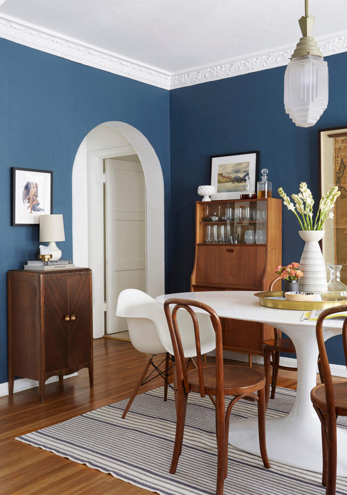
Ginny Macdonald’s dining room makeover has me seriously considering a coat of dark paint.
I spend most days from 5 to 7 a.m. perched in front of the computer with my coffee (always iced). On days you don’t see a blog post, it’s because I’m spending my time scouring the internet to find pieces for our house. Since the house is such a big part of my life and occupies a lot of my free time, I thought I’d share more updates into how things are progressing, starting with a room that has been untouched since we moved in: the dining room. After we painted and had the floors refinished, we put a decades-old table and chairs in the room (a hand-me-down from Dave’s parents) and turned our attention to the rooms we’d use more often, namely the master bedroom and the living room.
The room hadn’t been a priority for three reasons: furniture is expensive, it takes awhile for us to find pieces we both love and agree on, and we were fine using this coffee table as a makeshift dining space. We’re classy people, folks. Not having a proper dining space had been wearing on me, though. I mean, how else do you throw dinner parties like a proper adult if there isn’t a table and chairs for guests? How do I surprise Dave with a romantic meal without a table to set it on? Where do game nights happen? So many things happen in a dining room!
Where We Started
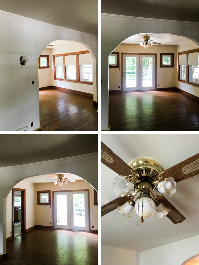
First of all, you can totally give me flak for these grainy, low-light photos. Shoddy “before” pics are one of my least favorite parts of home blogs, but I think it’s mostly because no one wants to spend time photographing a room that sucks much less editing those photos. These were quickly snapped on my phone before we laid down paper and started painting.
To give you some idea of the layout, these were taken while standing in our living room. I love the large archway, which gives the first floor a spacious feeling. To the right, there are three windows that look at our neighbor’s house, so we’ve left the shades there for now to offer privacy while we figure out what we want to do. The doors at the back lead to our deck. And the doorway to the left goes into the [less-than-photogenic, but a project-for-another-time] kitchen. That ceiling fan is just so hideously awful that I can’t believe someone kept it up for so long. (I say that, yet we’ve removed the blades and the shades and have been rocking that look for a year.) The walls were this depressing creamy yellow. I wondered if a chain smoker lived here at some point, but there are areas of paint in various rooms that were true white, so I think it was a design choice. (We painted the room white, for the record.) The red oak floors had their original finish from the 1920s, which is great for future owners because floors can be refinished roughly ten times before too much wood has been sanded away.
And, yes, it will forever drive me nuts that the patio door isn’t centered between those two windows. I’m hope there was a structural reason for it.
Our Inspiration
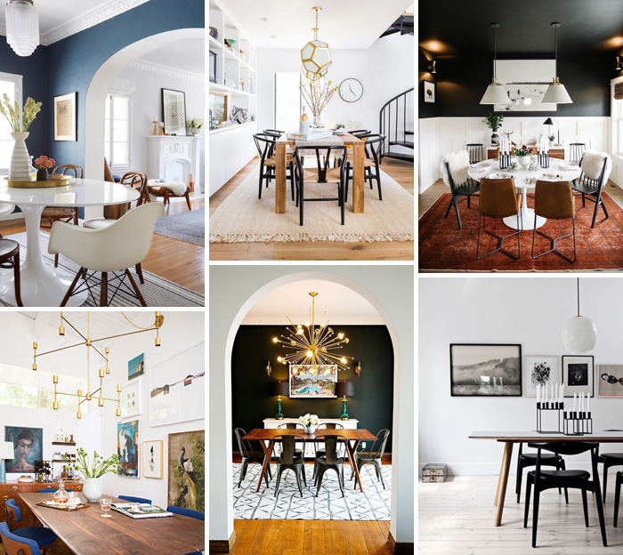
I honestly don’t know how to categorize our style. Mid-century modern, certainly. A bit of traditional. (I have such a penchant for schoolhouse lights.) Scandinavian. I prefer a more masculine palette that’s heavy on blue, green, grey, and brown — but with brass thrown in for good measure. And, ultimately, we both want our home to feel collected and not like it was plucked out of a showroom at any given time.
I feel like a lot of the rooms in this collage reflect that in some way. When we looked at some of the images that really spoke to us, it was clear that going mid-century modern for the dining room table and chairs would be the perfect way to ground the room, and serve as a jumping off point for both modern and traditional accents. Plus, a statement light fixture is obviously crucial to my future happiness. And that dark paint? Let’s just say I’m very tempted.
The Best Part: Shopping
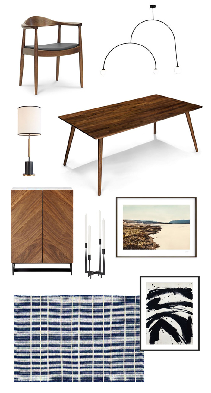
So, where does that leave us? Well, we purchased our table this week! I also ordered one chair to try with the table to make sure we like it in person before purchasing the others. It’s available at a few different retailers for slightly less, but paying $10 more per chair for easy returns at Home Depot was too tempting to pass up. I originally considered going with these chairs, but I just wasn’t feeling it. (Don’t get me wrong, though, that chair is gorgeous. I have one in our living room.) Below, you’ll find a look at where things are headed — at least in Photoshop. I’m loving how these pieces look together, and I’m crazy about the light fixture (an “inspired-by” version of this). My only hesitation is that it ships from Greece with a $75 shipping charge. It’s an affordable price point for a statement light fixture, but I’m not sure I feel comfortable spending that much sight unseen. If that’s the case or if the dimensions don’t work in our space, we’ll go with something else. We’re also keeping an eye out for a vintage storage cabinet similar to the one below just so that everything isn’t brand new.
Not pictured: white linen curtains and the curtain rod we’ll probably go with to add privacy to that set of three windows.

Sources: Chair | Table | Light Fixture | Lamp | Cabinet | Candle Holder | Prints: Seascape, Brushstrokes | Rug
–
Let’s keep in touch! Instagram / Facebook / Pinterest / Bloglovin’

